
Good self-storage website navigation does one job: it gets a renter from the first tap to a reserved unit in as few clear steps as possible. Keep the main menu to a handful of plain-language items (locations, unit sizes, rent or reserve, pay your bill, contact), put the phone number and a reserve button where people expect them, and make every facility page reachable in one or two clicks. If your site does that, search engines and AI assistants can also understand it. That matters because renters who can't find an answer quickly go back to the results page and pick the next facility.
TL;DR
- Limit the top-level menu to roughly three to five items that match what renters ask: where, what size, how much, how do I rent.
- Give every facility its own page with unit sizes, prices, availability, access hours and directions, and link to it from the menu.
- Design for thumbs first: large tap targets, a visible phone number and a reserve button on every screen.
- Build in accessibility (keyboard use, descriptive labels, readable contrast) because the rental flow is where complaints and legal claims begin.
- Measure with Search Console and analytics, change one thing at a time, and audit quarterly.
Table of Contents
- Why navigation decides whether a visitor becomes a tenant
- Start from the questions renters ask
- A menu structure that works for storage
- Build location and unit pages the menu can point to
- Search, breadcrumbs and secondary navigation
- Mobile first, because renters search on phones
- Accessibility is part of navigation
- How navigation helps you get found, not just used
- How to tell whether your navigation is working
- A short navigation checklist
- What we think about storage navigation
- Get a storage site that renters and AI tools can navigate
- FAQ
- Sources
Why navigation decides whether a visitor becomes a tenant
A storage renter is usually in a hurry and comparing several facilities on a phone. The Self Storage Association puts it bluntly: if a site doesn't quickly and conveniently provide the information customers need, they navigate to the next provider in the search results. The same piece ties user experience to conversion rates, customer satisfaction, loyalty and even staff efficiency, since a site that answers questions cuts down calls.
Navigation is the part of user experience a visitor meets first. The Self Storage Association describes global navigation as the element that tells customers what is available on the site, and says labels should be clear and tap targets large on both desktop and mobile.
There is also a ranking angle. Inside Self Storage describes SEO as the digital billboard and UX as the customer-service representative: search brings people in, and the experience once they arrive decides whether they stay. Its writer warns that paid or organic traffic can be lost to slow load times, confusing navigation and poor mobile design. You can buy a click, but you can't buy a confused visitor's patience.

Start from the questions renters ask
Before you touch a menu, list what a renter wants to know. In order, it is usually:
- Is there a facility near me?
- Is it safe and easy to access?
- What size do I need?
- How much does it cost?
- How does move-in work?
The Self Storage Association's renter-behavior survey data shows location is the number-one feature consumers care about. That is why location, not a company story, should lead your navigation. The same article recommends a clean, uncluttered map experience and showing all inventory with pricing, kept up to date.
Every menu item should answer one of those questions. If an item doesn't, it belongs in the footer or on a secondary page.
A menu structure that works for storage
A top-level menu for a single-facility operator can be as short as this:
| Menu item | What the renter finds | Why it earns a slot |
|---|---|---|
| Locations (or Our Facility) | Facility pages, map, address, hours | Location is the first decision |
| Unit Sizes & Prices | Size guide, rates, availability | Answers "what size" and "how much" |
| Rent a Unit / Reserve | Reservation or move-in flow | The conversion step |
| Pay Bill | Existing-tenant payment | Keeps tenants out of your phone queue |
| Contact | Phone, email, address, form | Reassurance for hesitant renters |
That is five items. Guidance on content organization commonly advises reducing top-level navigation to three to five items to cut cognitive load, and putting the most important items where they are noticed first. Treat that as a design target, not a law. A multi-location operator might replace "Locations" with a state or city dropdown, but the principle holds: short, concrete, and in the renter's words.
Name items the way renters say them
The U.S. Bureau of Indian Affairs' web guidance on navigation efficiency recommends descriptive, action-oriented labels that create what it calls information scent: the visitor can tell from the label what they will get. "Rent a 10x10" or "Reserve a Unit" tells a renter more than "Solutions" or "Services." Avoid internal jargon such as "Ancillary," "Portal" or "Offerings."
Don't chase a click count
The same guidance makes a point worth remembering: design for task completion, not a magic number of clicks. A visitor will accept five clicks if each step clearly shows progress, while one click to a confusing page causes frustration. For storage, that means a reservation flow can have several steps (pick size, pick date, enter details) as long as each one is labeled and shows where the renter is.
Put the heavy hitters in the expected places
The guidance also says frequently sought information belongs in high-visibility areas such as the top of the page or the primary navigation. In practice for a storage site:
- Logo top left, linking to the homepage.
- Phone number top right, as a tap-to-call link on mobile.
- A single, contrasting "Reserve" or "Rent Now" button in the header.
- Address, hours and a compact footer menu at the bottom of every page.
Build location and unit pages the menu can point to
A menu is only as useful as the pages behind it. Each facility deserves its own page that carries the information renters hunt for: unit sizes, pricing, availability, amenities, access hours and directions. The Self Storage Association advises keeping inventory complete and current, and it recommends keeping your phone number, address and email visible alongside a contact form.
A few patterns to follow:
- Show prices on the unit list, not behind a form. Renters who can't see a price assume it is high or that you are hiding it.
- Keep reservation close to the listing. The Association recommends making the purchase and online-pay sections visible and reducing the steps to complete a transaction.
- Don't bury the answer in the homepage. Inside Self Storage's secret-shopping comparison of four large operators' sites found that most homepages were transactional and overloaded with long unit lists, while one used a simple menu instead. It also noted that only one showed next steps on the same page as the reservation. Clear next steps after booking are an easy place to stand out.
- Write for what the unit does for the renter. Most visitors care about outcomes, such as fitting a one-bedroom apartment, not a feature list. Make the menu and unit-size labels reflect that, for example "5x5 (closet size)" next to the dimensions.
If you run several facilities, a consistent page template matters as much as the menu. A renter who learns where the price sits on one page should find it in the same place on the next. For the structural side of this, including how pages connect so AI tools can read them, see our guide to self-storage site architecture.
Search, breadcrumbs and secondary navigation
Primary navigation gets people started. Three supporting tools keep them moving:
- A search box or ZIP-code lookup. For multi-location operators, a location finder by city or ZIP code is often the fastest route to a facility page. Offer it as plain text input, not only a map.
- Breadcrumbs. A trail such as Home > Texas > Austin > 10x10 Units shows where the visitor is and lets them step back one level without hitting the back button. It also gives search engines a clear view of how your pages relate.
- Footer links. Use the footer for the second tier: FAQs, rental policies, insurance information, blog, moving tips and privacy.
Keep the header and footer consistent on every page. Consistency is a navigation feature in itself: visitors stop thinking about the menu and start thinking about their move.
One caution on mega menus. Listing every page in a giant dropdown feels helpful, but SEO guidance on restrained menus is that a short menu concentrates attention and link value on the pages that matter commercially. For a storage site, those are location and unit pages, not every blog post.
Mobile first, because renters search on phones
Most storage searches ("storage near me" and the like) happen on a phone, often outside the facility or while packing. That changes your priorities:
- Tap targets large enough for a thumb, with space between them so people don't hit the wrong link.
- A sticky header with a call button and a reserve button, so the two most valuable actions are always one tap away.
- Short forms. Ask only what you need to hold the unit. Every extra field costs reservations.
- Speed. Inside Self Storage cites a 2016 Google study finding that 53% of mobile users abandon sites that take longer than three seconds to load. Compress images and avoid heavy sliders and auto-playing video on the homepage.
- A hamburger menu with real labels. If you hide the menu behind an icon, make the icon recognizable and the expanded menu easy to scan.
If you are rebuilding or tuning a WordPress storefront-style site, the principles behind a clear ecommerce layout of menus, search and breadcrumbs translate directly: renting a unit is a purchase, and shoppers expect the same patterns.
Accessibility is part of navigation
A menu that works for a mouse and a good eye but fails for keyboard or screen-reader users shuts out customers and invites legal exposure. The W3C Web Accessibility Initiative lists the features that make navigation usable for everyone, including consistent and predictable labeling of links and controls, descriptive titles and headings, helpful error and success messages, more than one way to navigate (such as search and a sitemap in addition to menus), skip links for keyboard users, and visual cues about where you are.
Two details from the W3C are especially relevant to storage sites:
- Assistive technology sometimes reads link and button labels out of context, so "Click here" or "Learn more" is useless. "View 10x10 unit prices in Austin" is not.
- Too many skip links defeat their purpose. One at the top of the page, to the main content, is usually enough.
The rental flow is the highest-risk area. Practical checks for your own pages:
- Tab through the site with only the keyboard. Can you reach the menu, open it, choose an item and reach the reserve button, with a visible focus outline at every step?
- Make unit-size comparison charts real tables, not images.
- Offer an address or ZIP lookup in text form alongside any map.
- Make sure form errors name the field that has the problem.
- Check color contrast on text and buttons.
- Provide lease documents as properly structured pages or accessible files, not as unlabeled embedded documents.
If you are unsure where your own site stands, an accessibility audit by a qualified specialist, and legal advice from an attorney if you have received a demand letter, are the right next steps. For the three booking flows that most often cause trouble, our guide on ADA risk in storage booking flows walks through what to fix first.
How navigation helps you get found, not just used
Navigation is also how search engines and AI assistants learn what your site is about. Menu labels, internal links and breadcrumbs tell crawlers which pages are most important and how they connect. A tidy structure where each facility page is linked from the menu, from the city page and from the footer makes it far easier for your pages to be understood, indexed and recommended.
That is why menu design and local search strategy belong together. A clear "Locations" path with city-specific pages supports the tactics in our guide to self-storage SEO for facility operators and in near-me optimization. If your pages depend on scripts to show prices and availability, also read how server-rendered facts help AI systems read what renters would see.
How to tell whether your navigation is working
Don't guess. You need three kinds of evidence.
1. Search Console. Use Google Search Console to see which queries bring people to which pages, spot indexing problems, and check that titles and descriptions for your facility pages say what a renter wants to know.
2. Analytics. Use Google Analytics to find the pages where visitors leave, and compare mobile with desktop. A large gap between the two usually points at a mobile navigation or speed issue, not a demand issue. Watch the funnel, too: homepage to facility page to unit list to reservation start to reservation complete. The step with the biggest drop is where to work first.

3. Your own walk-through. Pick a phone and a real task: "Find a 10x10 near [your ZIP code] and start a reservation." Count the taps, note where you hesitate and ask a friend who has never seen the site to do the same. Do the same with a screen reader or keyboard once a year.
Then change one thing at a time: a menu label, a button position, a form length. If you change five things at once, you can't tell which one moved the numbers. Inside Self Storage recommends quarterly audits of metrics and user behavior, which is a sensible rhythm for a facility without a dedicated web team.
A short navigation checklist
- Menu of three to five items in renter language.
- Phone number and reserve button visible on every page and every screen size.
- A separate page for each facility with prices, sizes, availability, hours and directions.
- Breadcrumbs on facility and unit pages.
- Text-based ZIP or city lookup next to any map.
- Consistent header and footer everywhere.
- Keyboard and screen-reader pass completed in the last twelve months.
- Load time checked on a mid-range phone over mobile data.
- One tracked change at a time, reviewed quarterly.
What we think about storage navigation
Most storage sites we see treat navigation as decoration. We treat it as the first piece of search optimization a facility owns.
The reason is simple. Renters, search engines and AI assistants all ask the same questions of your site: where are you, what sizes do you have, what does it cost, how do I rent. If the menu and the pages behind it answer those cleanly, every channel benefits at once. If they don't, you pay twice: once for the traffic and again for the visitors who leave.
That is why our service pairs technical and on-page SEO with local search work and content built for conversational queries. Navigation, page structure and content are one system, and a facility that is easy for a person to understand is easier for an AI tool to recommend. Our system is designed for exactly that, built only for self-storage operators.
The practical advice is the same whether or not you ever work with us: keep it short, keep it concrete, and make the next step obvious.
Mike
Get a storage site that renters and AI tools can navigate
If your menu, facility pages and local presence need work, the Corvane system covers technical and on-page SEO, local search positioning, AI-optimized content (30 keyword-optimized articles published monthly), AI visibility audits and monthly performance reporting. It costs $299 per month with a one-time $50 onboarding fee, no contracts and no minimums.
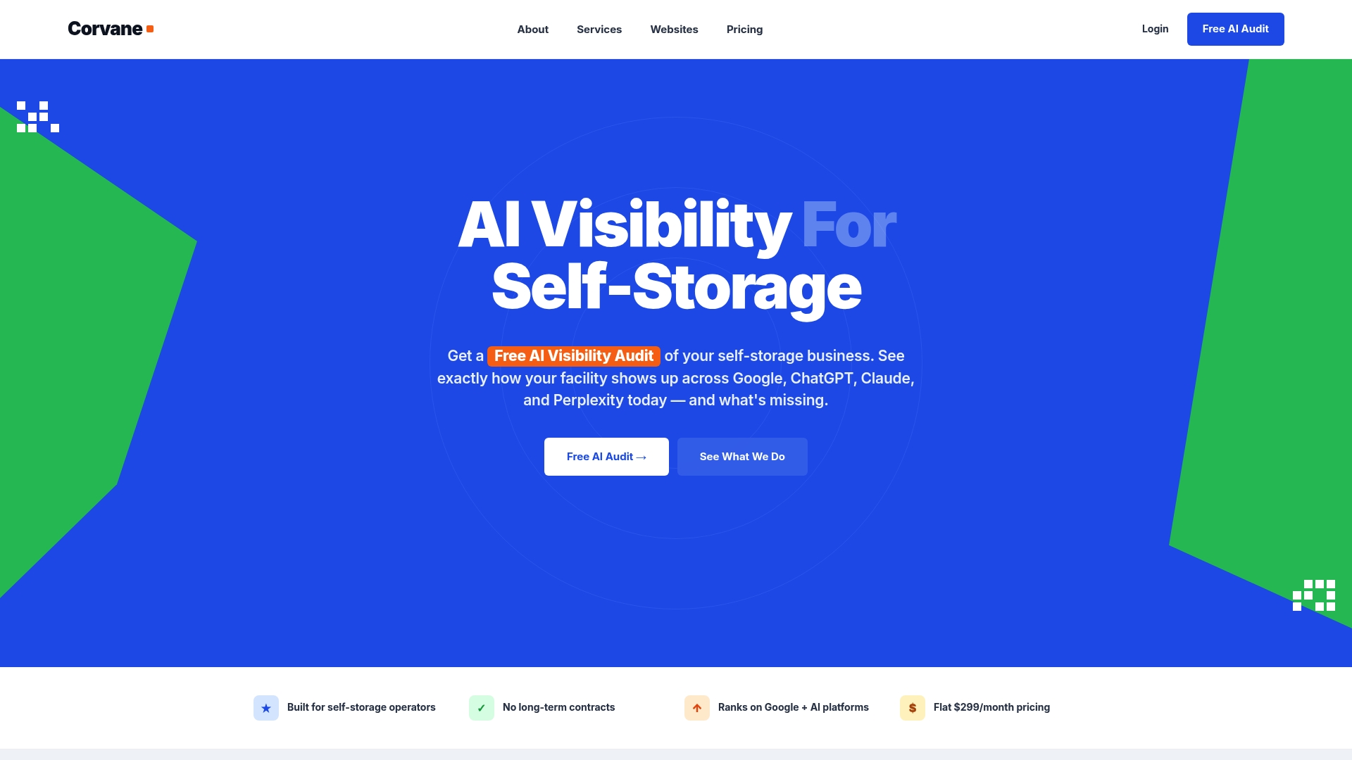
If the site itself is the problem, we also build custom, conversion-focused websites for storage operators. You can start with a free AI visibility audit to see how your facility currently appears in Google and in AI tools such as ChatGPT, Claude and Perplexity.
FAQ
How many items should a self-storage website menu have?
Aim for three to five top-level items, such as Locations, Unit Sizes & Prices, Rent or Reserve, Pay Bill and Contact. A short menu reduces decision effort and keeps attention on the pages that produce rentals. Anything else can sit in the footer.
Should I put prices in the navigation or on the unit pages?
Put a "Unit Sizes & Prices" item in the menu and show real prices on the page it opens. Renters want to compare cost quickly, and the Self Storage Association advises displaying all inventory with up-to-date pricing. Avoid price-on-request forms for standard units.
Does navigation affect SEO as well as user experience?
Yes. Menu links, breadcrumbs and internal links show search engines which pages matter and how they relate. Inside Self Storage notes that search engines now factor user experience into rankings, with fast load times, relevant content and smooth navigation tending to rank higher. A clear structure helps both people and crawlers.
How often should I review my website navigation?
A quarterly review of analytics, Search Console data and a hands-on mobile walk-through is a practical rhythm. Test one change at a time so you can see what worked. Run a keyboard and screen-reader check at least once a year, and after any redesign.
Sources
- Online Behavior of Self Storage Renters, Self Storage Association
- Why User Experience Is Important for Your Self Storage Website, Self Storage Association
- The 2 Prongs of an Effective Self-Storage Website, Inside Self Storage
- My Secret Shopping Adventure: Comparing Self-Storage Website Experiences, Inside Self Storage
- Navigation Efficiency, Indian Affairs web guidance
- Interaction: navigating and finding, W3C Web Accessibility Initiative
- Effective ecommerce layout: what to build and what to skip