
The fastest way to lift form conversions on a storage website is to cut visible fields to the minimum and make the booking form mobile-first and embedded directly on the page. Facilities that do this typically see higher completion rates and fewer abandoned reservations, because every extra field or redirect gives a renter one more reason to leave. The tactics below walk through exactly how to make that change, plus the layout, speed, and trust fixes that reinforce it.
TL;DR:
- Reducing the reservation form to three to seven essential fields significantly lowers abandonment rates, especially on mobile devices.
- Using a single-column, mobile-first layout with clear labels and matching input types improves user experience and completion rates.
- Embedding the form directly on the website and delaying account creation until after reservation confirmation keeps visitors engaged and on-site.
- Speed enhancements such as compressing images, removing unnecessary scripts, and lazy-loading content greatly increase form visibility and completion, particularly on mobile.
- Adding trust signals like facility photos, reviews, security details, and transparent pricing near the form boosts conversions by addressing renter concerns.
Table of Contents
- Quick checklist: 8 highest-impact form fixes you can apply today
- How to minimize fields and use progressive disclosure for reservations
- Layout, input types, and microcopy that reduce friction
- Design and trust elements around forms that increase completion
- How page speed and Core Web Vitals affect form conversions (technical checklist)
- Embed vs. redirect: the pros/cons and best practice for storage booking forms
- How to track form performance and run A/B tests that produce reliable lift
- Practical rollout plan and prioritization for owners with limited budget/time
- How Corvane Systems approaches form-conversion projects for storage clients
- Author perspective: why storage operators should treat form optimization as a revenue channel
- Offer: Corvane Systems' free AI visibility audit and custom website services
- Sources
- FAQ
Quick checklist: 8 highest-impact form fixes you can apply today
Most storage websites lose renters to friction they never notice: a phone form field that rejects dashes, a reservation button buried below a slow-loading hero image, an account creation step nobody asked for. The fixes below are ranked by impact and effort, so start at the top.
- Cut visible fields to 3 to 7: ask only for what you need to hold a unit, typically name, phone or email, unit size, and move-in date.
- Use a single-column, mobile-first layout: renters browsing on a phone should never have to zoom or scroll sideways.
- Hide optional fields by default: address line 2, referral source, and promo code fields belong behind a "add more details" toggle.
- Delay account creation: let someone reserve a unit before asking them to set a password.
- Embed the form on the page: keep the visitor on your site instead of redirecting to a third-party booking tool.
- Fix your loading speed first: a slow page kills conversions before a visitor even sees the form.
- Add trust signals near the submit button: a security badge, a review count, or a clear cancellation policy reduces hesitation.
- Set up basic event tracking: know how many people start the form, how many finish, and where they drop off.
None of these require a full site rebuild. A facility manager with access to a website builder or a developer on retainer can knock out the field reduction and copy fixes in an afternoon. The speed and tracking items take longer but pay off across every page on the site, not just the booking form.
How to minimize fields and use progressive disclosure for reservations
Field count is the single biggest lever in form design, and the research backs this up directly. Baymard's checkout research found the average checkout flow carries more than ten form fields, and that the total number of fields, not the number of steps, correlates most strongly with abandonment. Many sites only need about eight fields to complete a transaction. A storage reservation form asking for insurance details, a full billing address, and a marketing opt-in on the first screen is repeating the same mistake that inflates cart abandonment across e-commerce.
For a storage reservation, you need far less than eight fields up front. Storage-industry practitioners recommend keeping the initial reservation form to 5 to 7 fields, collecting everything else after the visitor has committed to a unit. A workable minimum data set looks like this:
- Full name
- Phone number or email
- Unit size or desired square footage
- Tentative move-in date
- Facility location, if you operate more than one site
Everything past that (billing address, insurance selection, government ID, lease signature) belongs in a follow-up step. Progressive disclosure is the technique that makes this work: instead of dumping every field on one screen, you reveal fields only as they become relevant. A toggle that says "need climate control or drive-up access?" can expand into unit-type options only when clicked. An address lookup tool that autocompletes city and state from a ZIP code removes three fields in one move. Delaying account creation until after the reservation is confirmed, a pattern Baymard specifically recommends, removes a common exit point entirely.
Lease terms and insurance are the two categories most operators try to front-load, and both can usually wait. Once someone has reserved a unit, they are already invested in the process, so a follow-up email or a guarded customer portal is a much better place to collect ID verification, insurance selection, and signed lease terms than the first form they see on your homepage.
Pro Tip: Test your reservation form on a phone with one thumb, the way most renters will actually use it. If you can't complete it in under a minute, your field count is too high.

Layout, input types, and microcopy that reduce friction
Field count solves half the problem. The other half is how those fields are laid out, labeled, and validated, and this is where a lot of storage sites lose renters through small, fixable mistakes.
NN/g's form usability research found that forms following basic usability guidelines produced significantly higher one-try submissions compared to forms that ignored them. That gap comes from a short list of concrete rules, all of which apply directly to a storage reservation form:
- Stick to a single column: a two-column layout forces the eye to guess which field comes next, especially on mobile.
- Put labels above fields, not inside them: a placeholder that disappears the moment someone starts typing is not a label, it is a trap for anyone who gets distracted mid-form.
- Match input type to the data you're asking for: a phone field should open the numeric keypad on mobile, and a date field should open a calendar picker instead of a blank text box.
- Size fields to match expected input: a two-character state field signals brevity, a wide text box signals "write more here."
- Mark required and optional fields explicitly: don't make renters guess whether skipping the referral-source field will block submission.
- Show specific, inline error messages: "Enter a valid phone number" is useful, "Invalid input" is not.
The tab sequence matters more than most site owners realize. If your form jumps from "name" to "unit size" and back to "phone number" because of how the code was written, you've broken the mental model a renter built while scanning the page. Test the tab order manually, not just the visual order, since these can drift apart after a redesign.
Microcopy is the last piece, and it's often an afterthought. "We'll only use this to confirm your reservation" next to a phone field reduces hesitation in a way that a privacy policy link buried in the footer never will. A button that says "Reserve My Unit" converts differently than one that says "Submit", because the first restates the benefit and the second just restates the action.
Design and trust elements around forms that increase completion
A well-built form still loses renters if the page around it feels generic or unverifiable. Storage is a category where people are handing over access to their belongings, often sight unseen, so trust signals near the form carry real weight.
The elements that matter most for a storage booking page are the ones that answer a renter's unspoken questions before they ask: is this facility real, is it secure, and is the price actually what's shown. That means:
- Facility photos near the form: real images of the unit rows and gate, not stock photography.
- Security details spelled out: gate hours, cameras, lighting, stated plainly rather than implied.
- Visible reviews or a star rating: a Google rating shown on the page does more work than a testimonial slider buried elsewhere on the site.
- Transparent pricing: the rate shown on the form should match what's charged, with no "call for pricing" surprise at the end.
- A short, clear guarantee or cancellation policy: "Cancel free up to 24 hours before move-in" removes a real objection.
Placement matters as much as content. A trust badge near the submit button reduces last-second hesitation, while the same badge in the footer does almost nothing. Confirmation screens are an underused spot too: a message that recaps the reservation details and next steps reassures a renter that the submission actually went through, which cuts down on duplicate submissions and support calls.
Speed and trust compound each other. Google's Milliseconds Make Millions research found that a large share of mobile visitors abandon a page that takes longer than three seconds to load, meaning a renter may never even see your trust signals if the page hasn't finished rendering.
Secure payment badges belong near any field that touches payment information, not scattered across the page. If your form collects a card number to hold a reservation, show the badge right there, at the point of hesitation, rather than assuming a renter will trust the whole site based on a padlock icon in the browser bar.
How page speed and Core Web Vitals affect form conversions (technical checklist)
Speed is not a background technical concern, it is a direct multiplier on whether your form gets seen at all. Google's Milliseconds Make Millions research found that a 0.1-second improvement in mobile load speed was associated with an average 8.4% rise in retail conversions, with even larger gains recorded for lead-generation form submissions in some of the analyses covered. The same research found that more than half of mobile visitors leave a page that takes longer than three seconds to load, which means a slow reservation page can lose renters before your carefully reduced field count ever matters.
Core Web Vitals give you a concrete way to measure this instead of guessing. The three metrics that matter most for a booking page are how fast the largest visible element loads, how quickly the page responds to the first tap or click, and how much the layout shifts around while loading. A hero image that loads late and pushes the reservation form down the page is a common, fixable cause of a poor score.
The highest-impact fixes, in order of effort versus payoff, are:
- Compress and properly size images, especially the facility hero photo that usually sits above the form.
- Cut third-party scripts you don't need: chat widgets, marketing pixels, and font loaders each add render-blocking weight.
- Improve server response time: a slow host or an unoptimized content management system delays everything downstream.
- Lazy-load anything below the fold: reviews, maps, and secondary content don't need to load before the form does.
- Preload the booking form itself if it's embedded via a widget, so it doesn't pop in after the rest of the page has rendered.
Test with Google PageSpeed Insights or Lighthouse before and after each change, and track the same page over time rather than comparing different pages against each other. For a storage site with a handful of location pages, prioritize the pages with the highest form traffic first: your speed budget is limited, so spend it where the reservation volume already is.
Embed vs. redirect: the pros/cons and best practice for storage booking forms
Keeping the reservation form on your own page almost always converts better than sending visitors to a third-party booking tool. Every redirect is a moment where a visitor can second-guess the click, get distracted by a new page loading, or simply bounce because the design suddenly looks unfamiliar. An embedded form keeps the visual context, the trust signals, and the momentum intact.
That said, redirects aren't always avoidable. Some storage management platforms only offer a hosted booking page, and rebuilding that functionality in-house isn't realistic for a small operator. When a redirect is unavoidable, a few things reduce the friction it creates:
- Match the visual design as closely as possible: same fonts, same color palette, same header, so the jump feels like a continuation rather than a departure.
- Set expectations before the click: a line of copy like "You'll complete your reservation on our secure booking partner" prevents the surprise that causes bounces.
- Open in the same tab, not a new one: a new tab adds a decision point that costs you conversions.
- Prefetch minimal booking data where possible: passing the unit size and location along in the URL saves the visitor from re-entering it.
For embedded forms, mobile behavior needs specific attention. The viewport should never force horizontal scrolling, and the on-screen keyboard shouldn't cover the field a visitor is actively typing into, a common bug on forms that weren't tested on an actual phone. If you're using a third-party widget, lazy-load it below the fold so it doesn't slow down the initial page render, and measure its performance separately from the rest of the page so you know whether the widget itself is a bottleneck.
How to track form performance and run A/B tests that produce reliable lift
You can't improve what you don't measure, and most storage sites track far less than they think. The starting point is defining your key events clearly: form view, form start (first field touched), form completion, and lease signed. Each of those is a separate conversion point, and the gaps between them tell you exactly where renters are dropping off.
Set this up with GA4 and Google Tag Manager, firing events for each stage of the form rather than just the final submission. If your booking system supports server-side events, use those alongside client-side tracking, since ad blockers and browser privacy settings increasingly interfere with client-side-only tracking.
Once tracking is in place, prioritize a small number of high-impact tests rather than testing everything at once:
- Field count: test your current form against a version with two or three fields removed.
- CTA copy: test a generic "Submit" button against language that restates the benefit, like "Reserve My Unit."
- Embed vs. redirect: if you currently redirect, test an embedded version against it directly.
- Trust placement: test adding a review count or security badge near the submit button.
Storage sites often run lower traffic than typical e-commerce tests, so expect longer test durations before results are reliable. Running a field-count test alongside a CTA-copy test at the same time will muddy your results, so isolate one variable per test and let it run long enough to see a full week of traffic patterns, since renter behavior often differs between weekdays and weekends.
| Metric | What it tells you | Where to track it |
|---|---|---|
| Form view rate | Whether visitors reach the form at all | GA4 page and scroll events |
| Form start rate | Whether the form is inviting enough to begin | GA4 form-field interaction event |
| Form completion rate | Whether the form itself is too long or confusing | GA4 form-submit event |
| Lease conversion rate | Whether completed forms turn into actual rentals | CRM or property management system |
When a test shows a clear winner, roll it out gradually rather than flipping the switch for all traffic at once, and keep monitoring the completion and lease conversion rates for a few weeks afterward. A win in form completion that doesn't show up in lease conversion is worth investigating before you call it a success. For a deeper walkthrough of connecting form events to actual lease outcomes, see this guide on mapping form submissions to leases.
Practical rollout plan and prioritization for owners with limited budget/time
Most storage operators don't have a dedicated conversion team, so prioritization matters more than the size of the to-do list. Sort every fix into a quick triage: high impact and low effort goes first, high impact and high effort goes second, and anything low impact gets parked.
- Do this week: cut optional fields, fix button copy, add a security badge near the submit button.
- Do this month: switch to single-column layout, fix input types (numeric keypad for phone, calendar picker for dates), set up basic GA4 event tracking.
- Do this quarter: tackle page speed fixes, decide on embed versus redirect, run your first A/B test.
Ownership matters too. Copy changes and field removal can usually be handled by whoever manages the website content, often the facility manager or marketing person. Speed fixes and tracking setup typically need a developer, and if you don't have one on staff, this is where outsourcing to an agency or freelance developer usually pays for itself faster than trying to learn Core Web Vitals from scratch. For related context on why leads stall out before they convert, see this breakdown of why storage websites don't generate leads.
A realistic 30/60/90 plan looks like this: by day 30, your form should have fewer fields, clearer copy, and basic event tracking live. By day 60, layout and input-type fixes should be shipped, along with your first speed audit. By day 90, you should have completed at least one A/B test and rolled out the winner.

Pro Tip: Don't wait for a full redesign to fix your form. Field reduction and copy changes can often be shipped in a day and start showing impact within a week of tracking.
How Corvane Systems approaches form-conversion projects for storage clients
Corvane Systems is an SEO and AI search visibility agency built specifically for self-storage facility operators, and form conversion sits downstream of a problem we see constantly: a facility ranks well or shows up in an AI-generated answer, but the page that visitor lands on wasn't built to convert them.
Our approach to a storage site's forms starts with the same technical and on-page audit we run for search visibility, because the two are connected: page speed, mobile usability, and structured content all affect both search rankings and form completion. What we look at includes:
- Technical and on-page health: site speed, mobile rendering, and indexing issues that also affect Core Web Vitals.
- Local search positioning: whether the pages driving form traffic are the ones actually ranking for "storage near me" searches.
- AI-optimized content structure: whether your service and pricing pages are formatted in a way that AI tools like ChatGPT, Claude, and Perplexity can accurately reference.
- Performance tracking: monthly reporting on keyword rankings, organic traffic, and search visibility, so form and lead volume can be tied back to specific changes.
This maps directly onto the 30/60/90 approach above. Search visibility work and form optimization move in parallel, since driving more visitors to a form that still has ten fields on it wastes the traffic gain.
Author perspective: why storage operators should treat form optimization as a revenue channel
I've watched storage operators pour budget into ads and local SEO while their reservation form quietly leaks half the traffic those efforts generate. The form isn't a technical afterthought, it's the last checkpoint before revenue, and it gets less attention than almost anything else on the site.
Two things stand out from working with storage operators directly. First, the biggest wins usually come from subtraction, removing fields and steps, not from adding a slicker design. Second, speed fixes get postponed longer than they should because they feel invisible compared to a redesign, even though the data on abandonment says otherwise.
The trade-off is real: field reduction sometimes means collecting less qualifying information up front, which can mean a slightly noisier lead list. That's a fair trade for most facilities, since a completed reservation with a follow-up call beats an abandoned form every time.
— Mike
Offer: Corvane Systems' free AI visibility audit and custom website services
Fixing your form gets you further conversions from the traffic you already have. Getting found in the first place, by Google and by the AI tools renters increasingly ask instead, is the other half of the equation, and it's the part Corvane Systems built its entire service around.
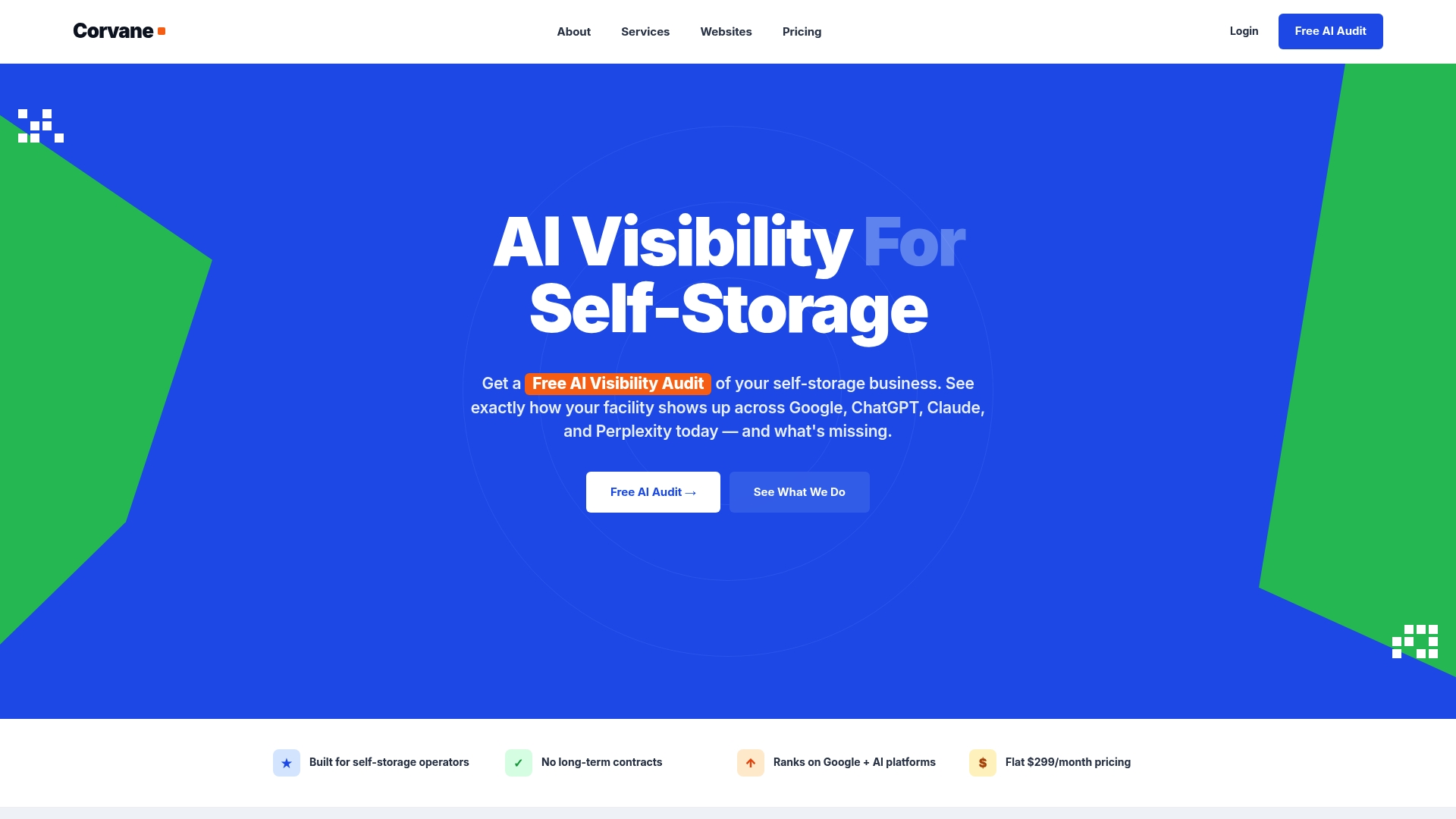
Corvane Systems offers a flat-rate SEO and AI search visibility service for storage operators that includes technical SEO, local search positioning, and AI-optimized content, all provided for a single monthly rate. If your site needs a stronger foundation before any of the form fixes above will matter, custom, conversion-focused website services are available for storage operators. The starting point for either is a free AI visibility audit, which provides insight into how a facility currently appears across Google, ChatGPT, Claude, and Perplexity. Request your free AI visibility audit to see where your facility stands.
Sources
- Checkout Optimization: Minimize Form Fields – Baymard
- Website forms usability: Top 10 recommendations - NN/g
- Milliseconds Make Millions: What Google's own research shows about website speed and the cost of a slow page
- Industry practitioner guidance on form field reduction
FAQ
How can I convert paper forms to digital format?
Rebuild the paper form as a digital form using a form builder or your website's content management system, keeping only the fields that are truly necessary for a first contact. Match each digital field to the correct input type, such as a numeric keypad for phone numbers, and test the finished form on a phone before publishing it.
Can you give me an example of data conversion?
In the context of storage websites, data conversion usually means turning a paper reservation slip or a spreadsheet of inquiries into structured fields in a digital form or CRM. A common example is converting a walk-in inquiry sheet into an online reservation form with the same fields, name, contact information, unit size, and move-in date, so the data flows directly into a property management system.
How can I convert my forms to PDFs?
Most form builders and content management systems include a built-in export or "print to PDF" option that generates a PDF version of a submitted form. For a storage reservation form specifically, it's usually better to keep the live version as an interactive web form and only generate a PDF copy for records or lease documentation after submission.
How do I convert data storage units?
Converting data storage units, such as megabytes to gigabytes, is a separate topic from website form optimization and typically involves standard unit conversion tools built into operating systems or available through a basic online calculator. If this question relates to digital storage capacity rather than a self-storage facility, a standard unit converter will handle it directly.