
A storage facility map is defined as a real-time, interactive visual layout of a storage property's units, showing availability, size, and status at a glance. The industry term for this tool is a facility site plan, though operators and customers alike use "storage map" interchangeably. Understanding what is a storage facility map matters whether you are renting a single unit or managing a 500-unit property, because the map is the operational backbone of every modern storage business. Digital maps have replaced error-prone spreadsheets and static floor plans, connecting unit availability directly to lease automation and pricing tools.
What is a storage facility map and how does it work?
A storage facility map is a visual, interactive representation showing every unit's occupancy status in real time, integrated with property management software. Each unit on the map carries a live status: available, reserved, or occupied. That status updates automatically when a tenant signs a lease, makes a payment, or vacates a unit.
The shift from static paper plans to digital maps is a full operational upgrade, not just a cosmetic change. Paper floor plans required staff to manually cross-reference spreadsheets, which introduced booking errors and slowed customer service. Digital maps reduce those errors by connecting the visual layout directly to the management system's database.

Modern facility maps also feed into dynamic pricing engines. When occupancy in a specific unit size climbs above a threshold, the pricing tool adjusts rates automatically. Operators get revenue analysis by unit type, aisle, or building section, all visible through the same map interface.
Customers benefit just as directly. Interactive maps let tenants browse units by size and availability, compare options visually, and complete a reservation online without calling the office. That self-service capability reduces wait times and improves the rental experience from the first click.
- Unit status colors: Green typically signals available, yellow signals reserved, and red signals occupied. Color coding lets staff and customers read availability in seconds.
- Filter tools: Customers can filter by unit size, climate control, floor level, or drive-up access directly on the map.
- Reservation links: Clicking a unit on the map opens a booking flow, connecting the visual choice to the lease agreement.
- Staff view vs. customer view: Operators see additional metadata like pricing history and tenant contact details. Customers see a simplified version focused on availability and features.
Pro Tip: Ask the facility for a digital map link before visiting in person. You can identify your preferred unit, check its exact dimensions, and confirm availability without making a trip.
Key design principles behind a storage facility layout
A storage facility layout is not designed arbitrarily. Every aisle width, unit cluster, and entrance position reflects a deliberate decision that affects safety, revenue, and customer flow. Design guidelines recommend 24–26 foot drive aisles and 8–10 foot pedestrian corridors to balance vehicle access with safe foot traffic. Those measurements show up directly on the facility site plan.
Local market demand shapes the unit mix on the map. A facility in a dense urban area may dedicate most of its footprint to small 5x5 and 5x10 units, while a suburban facility near residential neighborhoods may prioritize 10x20 and 10x30 units for household moves. Mismatching the layout to local demand produces wasted space and slower lease-up, which the map makes painfully visible when entire sections stay red for months.
Compliance requirements are embedded in the design from the start. Fire codes dictate minimum aisle widths for emergency vehicle access. ADA accessibility standards require specific corridor widths and accessible unit placement. A well-drawn facility site plan documents compliance with both, protecting the operator during inspections and giving customers confidence in the property.
The four design factors that appear on every professional storage map are listed below in order of their impact on profitability:
- Rentable area ratio: The percentage of total square footage dedicated to rentable units versus corridors, offices, and mechanical rooms. Higher ratios mean more revenue per square foot.
- Aisle configuration: Straight aisles with clear sight lines reduce accidents and make navigation intuitive for first-time tenants.
- Unit size distribution: The mix of small, medium, and large units should reflect local demand data, not the developer's preference.
- Access point placement: Entrances, exits, and gate locations on the map determine traffic flow and security camera coverage.
| Design factor | Operator impact | Customer impact |
|---|---|---|
| Aisle width (24–26 ft) | Meets fire code, allows moving trucks | Easy vehicle access, less stress |
| Unit size mix | Maximizes occupancy and revenue | More choices that fit actual needs |
| ADA corridors | Avoids compliance penalties | Accessible for all tenants |
| Entrance placement | Controls traffic and security | Clear, intuitive navigation |
A well-designed layout directly improves financial performance by maximizing rentable area and guiding tenant traffic naturally. Even small layout improvements compound into meaningful revenue gains over a facility's lifetime.
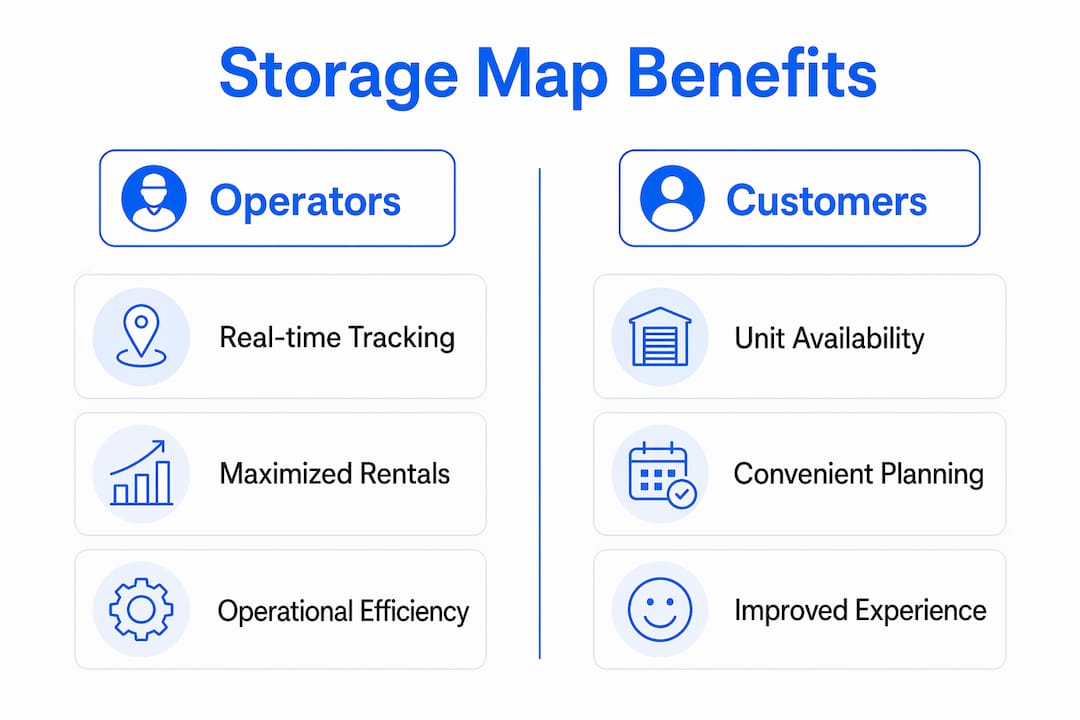
Benefits of storage maps for operators and customers
Storage facility maps are active sales and operational tools, not passive reference documents. Operators who treat maps as active assets report faster lease-up speeds and fewer customer service calls, because tenants can self-navigate both online and on-site.
Real-time occupancy tracking is the most direct operational benefit. When a unit's status updates the moment a lease is signed, managers avoid double-bookings and can spot availability gaps by unit type instantly. That visibility feeds directly into dynamic pricing decisions, letting operators raise rates on high-demand unit sizes before occupancy peaks.
For business owners storing inventory, the map becomes a planning tool. You can identify which units sit closest to the loading dock, which have climate control, and which offer drive-up access, all before signing a lease. Metadata like climate control status and unit dimensions helps staff filter units efficiently during walk-in customer service, cutting the time from inquiry to signed lease.
Key benefits by audience:
- For operators: Reduced booking errors, real-time occupancy dashboards, faster staff response during walk-ins, and integration with dynamic pricing tools.
- For individual renters: Visual unit selection, online reservation without phone calls, and clear navigation to the unit on move-in day.
- For business owners: Filtering by attributes like climate control and proximity to loading areas, plus the ability to manage multiple units from a single tenant portal.
- For facility managers: Advanced maps integrate with inventory tracking, turning the layout into a navigation tool that pinpoints specific storage locations for staff during audits.
Pro Tip: If you manage a facility, check whether your map software exports occupancy reports by unit type. That data tells you exactly which sizes to add or reduce in your next expansion.
How to read a storage map effectively
Reading a storage facility map takes less than two minutes once you know what to look for. The map divides the property into zones, typically labeled by building letter or aisle number. Each zone contains a cluster of units, and each unit is labeled with its number and size.
Color coding is the fastest way to read availability. Available units appear in one color, reserved units in another, and occupied units in a third. Most digital maps include a legend in the corner. Check the legend first before scanning the map, because color schemes vary by software platform.
Practical steps for reading and using a storage map:
- Identify your size first: Filter by the unit size you need before looking at the map. This removes occupied and irrelevant units from view immediately.
- Check zone location: Look at where available units sit relative to the entrance, elevator, and loading area. A unit near the loading dock saves significant time on move-in day.
- Confirm access type: The map should indicate whether a unit is drive-up, interior corridor, or upper-floor. Indoor storage units offer climate protection but require elevator access, which matters for heavy loads.
- Review special features: Icons or labels on the unit indicate climate control, extra-wide doors, or ground-floor access. These details affect your daily experience.
- Use the map to plan your path: On move-in day, pull up the digital map on your phone. Identify the nearest entrance to your unit and the most direct aisle route. This prevents the frustrating experience of carrying boxes through the wrong section of a large facility.
Storage unit organization becomes far easier when you use the map to plan your layout before you arrive. Knowing your unit's exact dimensions from the map lets you pre-plan where furniture, boxes, and shelving will go.
Key takeaways
A storage facility map is the single most important operational tool a facility runs, because it connects real-time unit availability, pricing, compliance, and customer navigation into one visual interface.
| Point | Details |
|---|---|
| Digital maps replace spreadsheets | Real-time status updates eliminate double-bookings and manual tracking errors. |
| Layout design drives revenue | Aisle widths, unit mix, and access points directly affect occupancy rates and profitability. |
| Maps serve both operators and customers | Operators get occupancy dashboards; customers get self-service unit selection and navigation. |
| Metadata improves service speed | Climate control status and unit dimensions help staff match customers to the right unit faster. |
| Simplicity is a design requirement | Overcomplicated maps reduce usability for both staff and tenants, slowing down operations. |
Why storage maps matter more than most operators realize
I have worked with storage operators across markets of every size, and the pattern is consistent. Facilities that treat the map as a living operational tool outperform those that treat it as a static diagram. The difference shows up in lease-up speed, customer satisfaction scores, and staff efficiency during peak periods.
The most common mistake I see is overloading the map with detail. Operators add every possible data field, every historical note, every maintenance flag, until the interface becomes unreadable. Simplicity in map interfaces is critical. Too much detail reduces usability and slows down the staff who rely on it most. A map that takes 30 seconds to interpret is a map that gets ignored.
The second mistake is treating the map as an IT project rather than a sales tool. The map is often the first thing a prospective tenant interacts with on your website. If it loads slowly, shows outdated availability, or lacks filtering options, you lose that customer before they ever call. Storage facility maps influence lease-up speed directly, and that connection is underappreciated.
My advice is straightforward. Audit your map the way a first-time customer would. Open it on a phone, filter for a 10x10 unit, and try to reserve it in under three minutes. If you cannot do that, your map is costing you bookings every day.
— Mike
How Corvanesystems helps storage operators get found and booked
Storage operators who invest in a great facility map still lose customers if that map never gets seen. Corvanesystems is built specifically for self-storage operators who need their facility to surface when potential tenants search on Google or ask an AI assistant for recommendations.
Corvanesystems combines traditional SEO with Generative Engine Optimization, structuring your facility's digital presence so it appears in AI-generated answers on ChatGPT, Perplexity, Claude, and Google AI Overviews. The service includes 30 keyword-optimized articles published monthly, local search positioning, and AI visibility audits that show exactly where your facility stands. Pricing is one flat monthly rate with no contracts. See how Corvanesystems works and find out what it takes to turn online searches into booked units.
FAQ
What is a storage facility map?
A storage facility map is a visual, interactive layout of a storage property's units showing real-time availability, unit sizes, and occupancy status. It integrates with property management software to automate lease tracking and pricing.
How do I read a storage map?
Check the color-coded legend first, then filter by unit size and preferred location relative to the entrance or loading area. Available units appear in a distinct color, and clicking a unit reveals its dimensions and features.
What are the benefits of storage maps for business owners?
Business owners can filter units by climate control, proximity to loading docks, and size before signing a lease. Advanced maps also integrate with inventory tracking tools, making it easier to manage stock stored across multiple units.
What design standards apply to a storage facility layout?
Industry guidelines recommend 24–26 foot drive aisles and 8–10 foot pedestrian corridors. Layouts must also meet fire code requirements and ADA accessibility standards, both of which are documented in the facility site plan.
Why do some storage maps feel confusing to use?
Overcomplicated maps with too many data fields reduce usability for both staff and customers. Effective map design prioritizes clarity, showing only the information needed to select and reserve a unit quickly.